Ugh.
Such was the case with this comp from 2007. I wrestled with how to render it for a while until finally deciding, "If he wants photorealism, I'll give him photorealism!" So instead of drawing this comp, I manipulated some photography in Photoshop. Thank GOD for Photoshop!

These days you have to be part illustrator and part photo retoucher/manipulator. It took me a while to realize that art directors really don't care how you achieve the results they're after... as long as it explains the concept as accurately as possible to the client, they're happy.
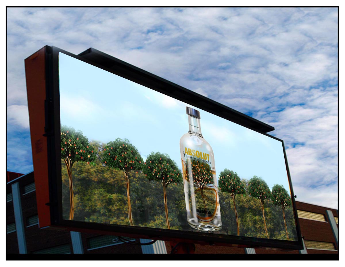
All of these were created by finding suitable photo scrap online and messing around with it.

It seems weird, even to me as I look at these now, but the idea was to get as realistic a look as possible while still suggesting that they were 'drawings' - not photography - thus the addition of rough sketching over top.

This second job reinforces even more emphatically my point about ADs wanting their 'vision' presented as accurately as possible. The AD on this project wanted to show a stressed-out man's face as though it were made of electronic component wires. I figured I had it sewn up by doing the drawing with one of my favourite Painter tools: the Scratchboard Rake.
But he felt it "wasn't quite there"... could I show it to him as a mass of coloured wires...?
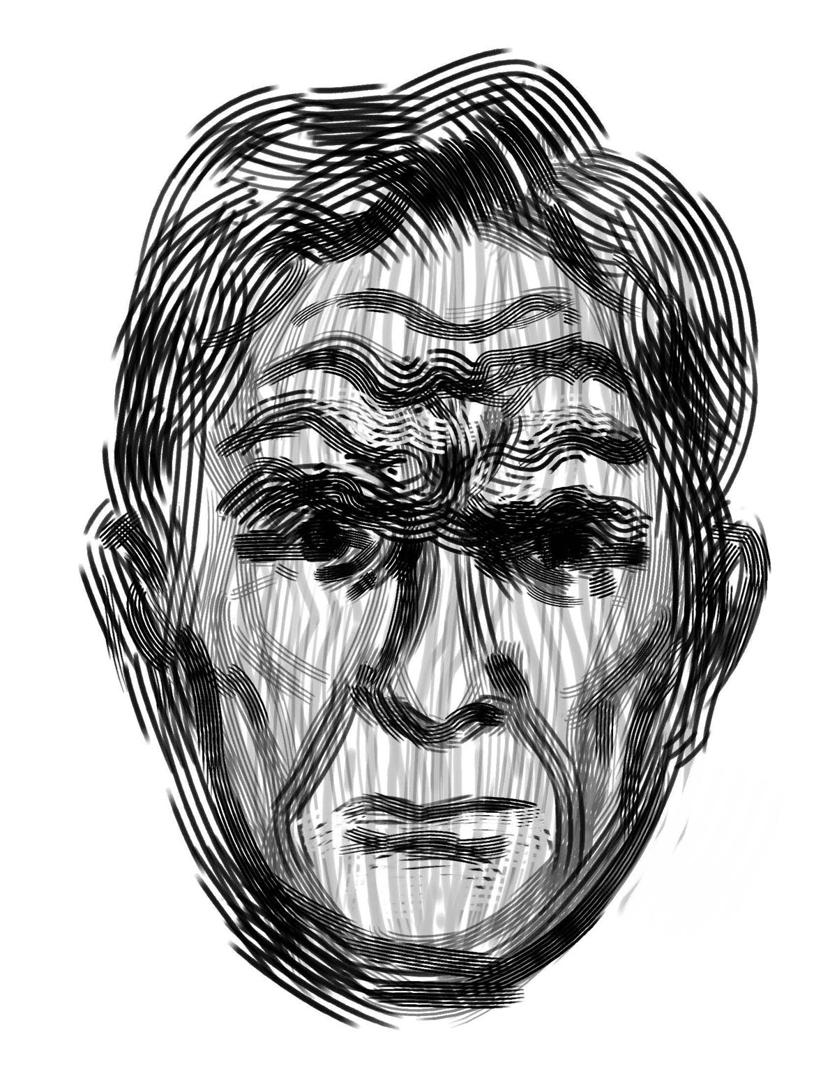
No problem. Here's the second pass. "Still doesn't quite read as a mass of wires," he fretted.

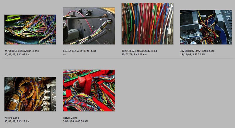
So I searched up some scrap on Flickr...
... and *voila!* a man's stressed out face made of a tangle of electronic component wiring.
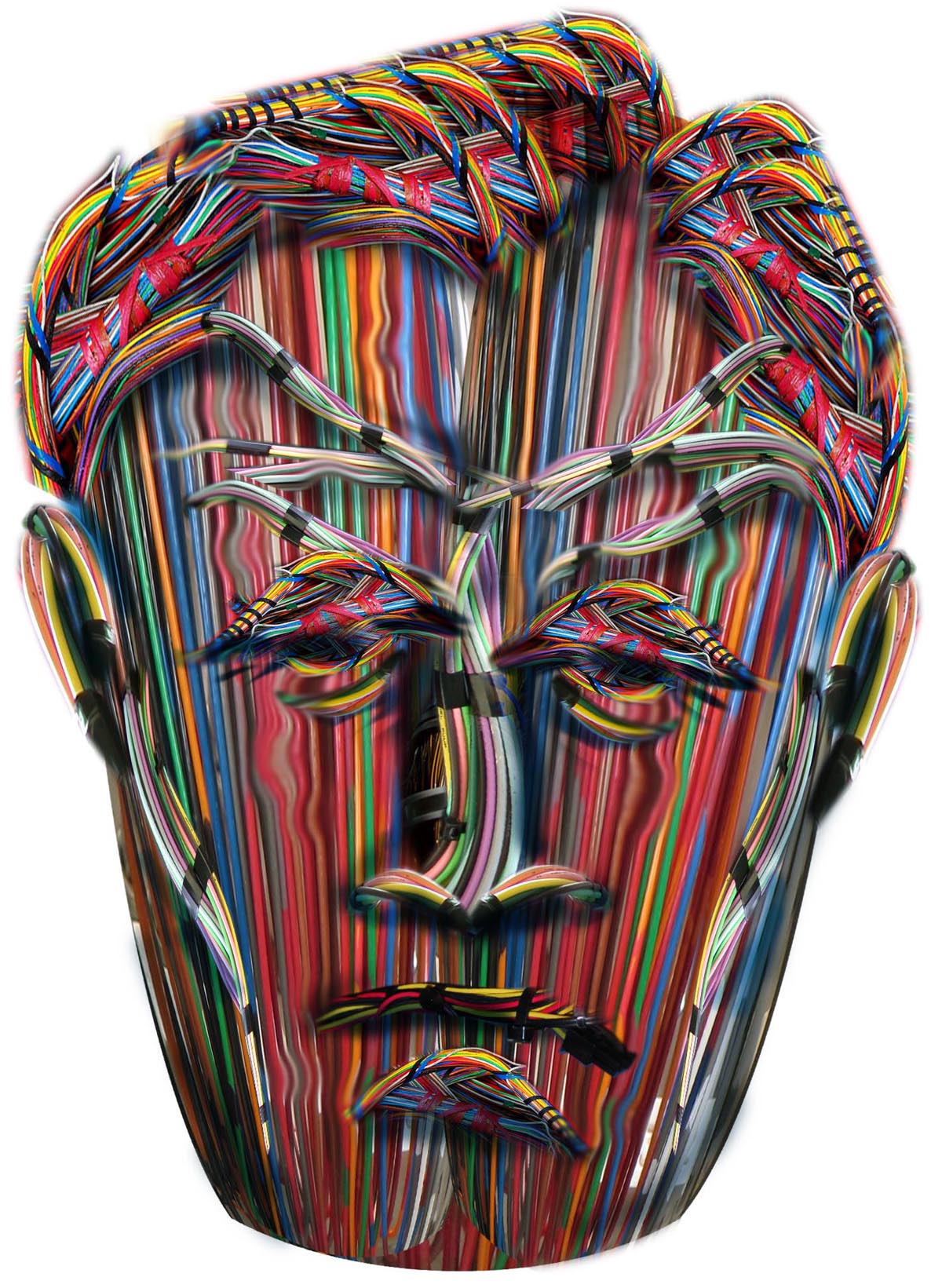
The AD was very happy.
More of my work here.
No comments:
Post a Comment