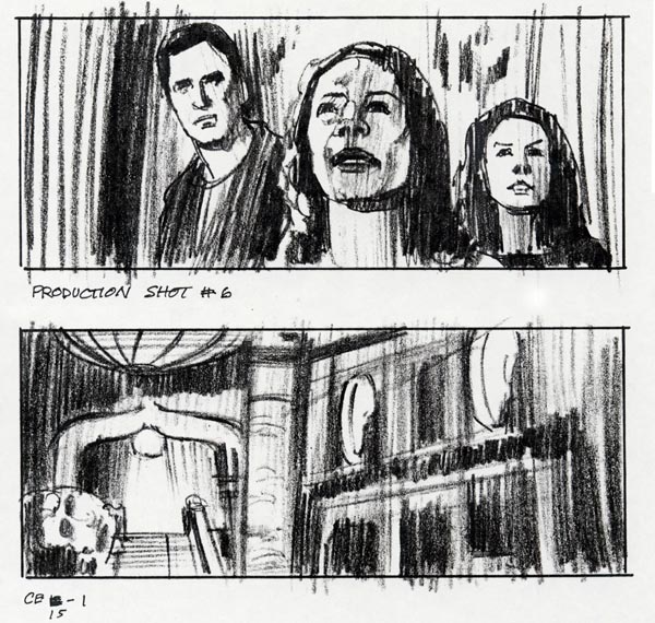
Phil Tippett had worked for George Lucas in the past and started his own special effects production studio, building a very good reputation in the movie industry. He was looking for an experienced storyboard illustrator with special effects movie experience. Knowing Lucas Films would be a good source, he asked for their recommendation.

I was contacted by Tippett Studios, and informed that they were working on a new horror movie for Dreamworks, that was being filmed in England in an old Gothic mansion. They wanted me to create and illustrate a visual sequence of special effects, that would ultimately be generated by a very sophisticated computer process. Although, the movie was shot in color, the concept frames would be done in black and white, similar to my Star Wars frames. It would require at least several
weeks of very intense focused time out of my schedule. Having worked on "Star Wars" gave me an understanding and the confidence I would need for the project.
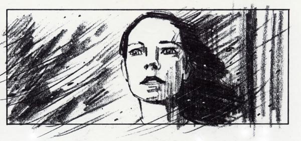
The posted random frames are some of the shots that I managed to copy and save. They are more or less in the correct sequence.
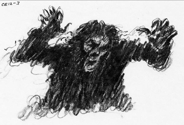
At this point in the film, the main characters were being confronted by the physical transformation of the evil spirit or entity that is terrorizing them. It begins with a wisp of smoke from wood burning in the fireplace, that rises up and across the high ceiling, and gradually morphs into a shroud that becomes the wild looking evil 19th century tycoon that had once owned and lived in the mansion.


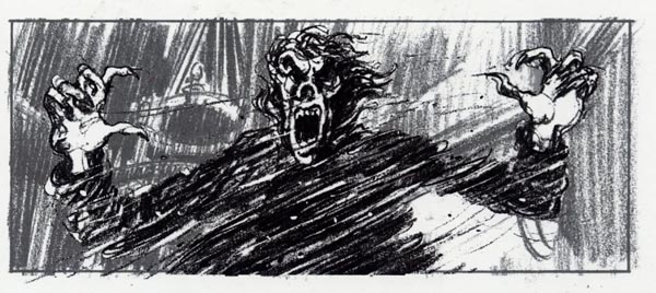
One of the women, who is part of a scientific experiment, overcomes her terror and defiantly makes a stand against the raging evil spirit. Her defiance becomes her protection against physical harm from his evil power. In the end, the evil spirit consumes himself in an enormous storm of rage and fury. In the last sequence of frames, as he grows weaker and weaker, his flesh tears away from the bone, and ultimately his bones crumble into dust, freeing the mansion from his evil force.
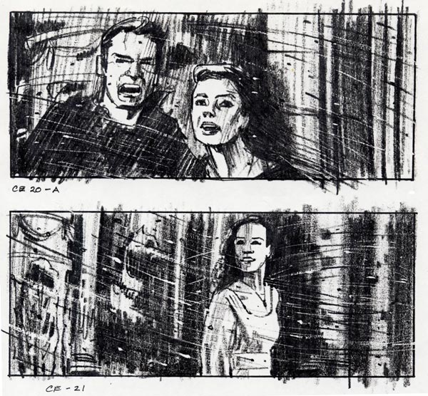
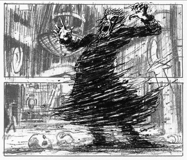
The original concept was a very dark sophisticated adult remake of the original 1963 version. The "numbers crunchers" decided to release it right after school let out, and therefore they diluted the special effects scenes from our original concept. As a result, much of the tense visual effects were gutted so it would be more appropriate for a young audience. The film generally got bad reviews, except for the special effects.
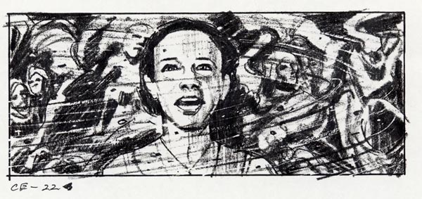
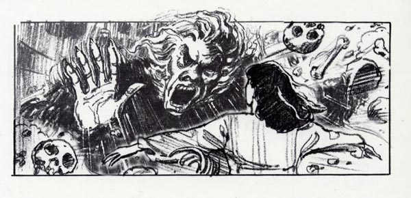
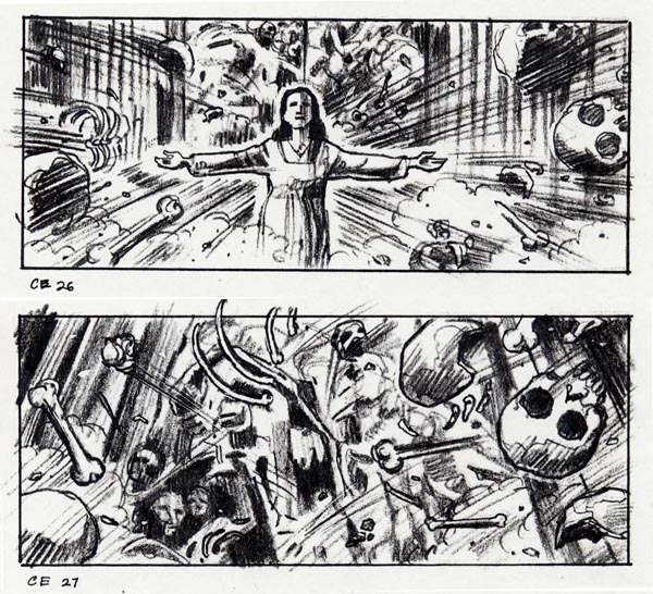
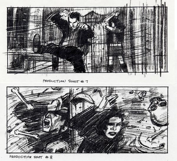
Since I try to stay on the opposite side of evil, it was a real challenge to develop this gruesome looking menacing force. The rough impressionistic drawing technique I used to depict the sense of raging fury, was quite different from my normal drawing style.
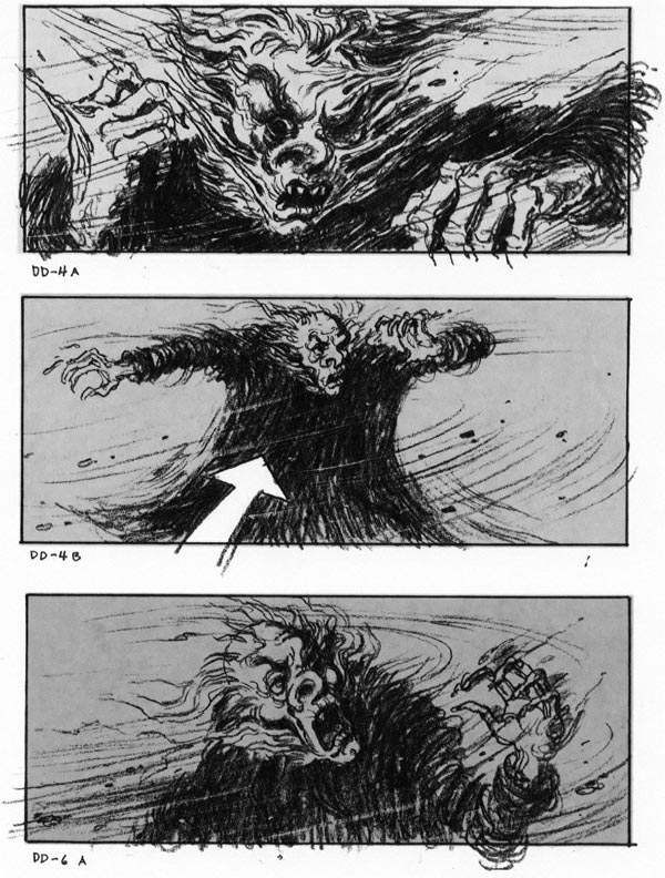
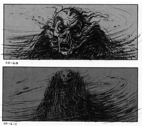
This was not the typical subject that storyboard illustrators normally create, but it was an interesting change of pace. Phil Tippett and his staff were a pleasure to work with, and it made my job that much more enjoyable.
* Many thanks to Tom Watson for sharing these frames - and his experience of drawing them - with us! Got a storyboard or comp job you'd like to show us? Send me an email at the address in the sidebar and I'll send you a guest author invite OR I can post your material for you if you prefer.
No comments:
Post a Comment