I was commissioned to work on the creative and visual development of the Episode 1 movie, late in the 1990's. We all worked in a high security area at Skywalker Ranch (Lucas Corporate Headquarters) in Northern California, about 35 miles from my house.

Nothing was allowed to leave the premises, not even a rough tissue sketch. Pencil tissues were first approved, then we sketched the frame in light blue pencil on smooth Xerox paper. With a dozen pre-sharpened graphite medium weight pencils, we more carefully drew over the blue pencil guide lines, adding some shading. Some frames required more realistic detail, others less detail. This was all done before actors were selected, and character development, costuming, backdrops and props were still in the planning stages. Therefore, we drew from our imaginations or adhered to whatever was predetermined, to give continuity throughout all the frames. We had no time for models or additional research.
We each worked as fast as we possibly could and keep a consistent look to all the frames. It had to look like it was done by one illustrator, not 10 different illustrators. As each drawing was finished, it was Xeroxed and tacked side by side, frame by frame on the walls of George Lucas' conference room, next to the art department. The light blue lines dropped out of the copies, leaving only black lines from the graphite pencil.

We each worked on different segments of the movie, so no one illustrator would know the complete story. Eventually, the entire movie would fill 4 walls of the conference room in one single row. Lucas would pop in and out to check on the sequence and flow. On the walls, he could visualize the whole movie through hundreds of storyboard frames. They were also individually scanned into his computer in sequence, so he could sit and study each frame on his monitor. When they were all completed, he would start making verbal and written revision, corrections and eliminate scenes that didn't work... then back to our drawing boards.

He was a stickler on getting it right and expected the highest quality from all of us. He was always looking "out of the box" in developing the characters and story line, and he understood how to work with and get the most out of his creative team, whether they were full time or freelance like myself. It struck me that for a very creative science fiction writer and visionary, George Lucas was comfortably "down to earth" with all of us. It was a memorable and enjoyable experience to work with him and his amazing creative team, and be a behind the scenes part of one of his epic movie series.

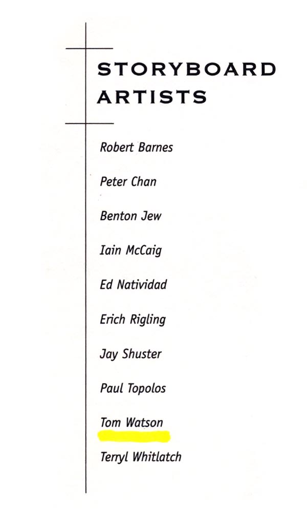
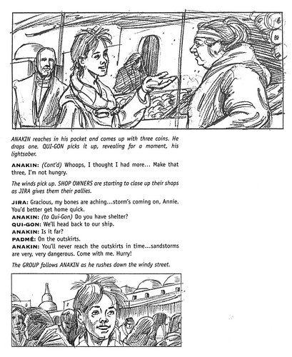
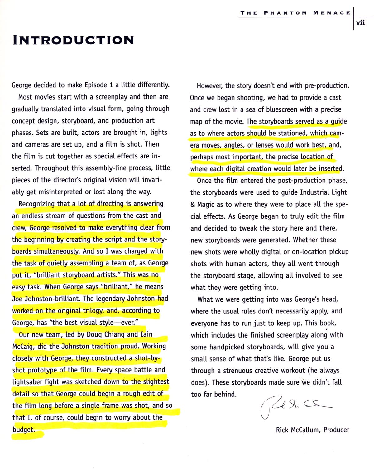
After the movie was released, I asked for copies of storyboard frames, that I had done. Lucas Licensing Division was ready to release a soft cover book on the illustrated screenplay of the movie. They picked out key random frames to show the sequential screenplay of the entire movie. I was sent several copies of the book, which had 2 of my storyboard frames. There were hundreds of frames that had to be left out of course, due to the limited size of the book. Most of the names of illustrators on the list I attached, were working full time for Lucas Films or Industrial Light and Magic, which is a Special Effects Division that created and produced TV commercials. I also added the movie producer's introduction (see below), which explains more about the concept and usage of the storyboard frames. When I asked if I could get copies of other frames I did, they informed me that they weren't allowed to release anything that was part of the movie, to protect their licensing agreements and legal considerations. So, unfortunately I have no other frames.

* If you'd like to guest author a post on Storyboards and Comps dot Com, just drop me a line at leifpeng[at]gmail[dot]com. Show us your work, tell us about your career, a nightmare project you survived (or didn't!), or share old comps, sketches and marker renderings by past masters of the craft.
Hi tom!
ReplyDeleteGood to hear from you!
I always thought it was a shame that they never released the entire set of storyboards in book form,( as they often do for anime in Japan ) as this was one of the few features I've worked on where just about every shot in the film was storyboarded. There was some astounding work done, and "the illustrated screenplay" book only scratched the surface.
It's funny as you saw it as having to look like one illustrator. The cool thing for me to see was the variety of styles that was displayed in these boards. Iain's boards with their romantic realism, Peter Chan's cleaner, cartoonier work, Jay's sharp, techie, but whimsical style. All very different from one another.
There are so many talented illustrators whose work goes unnoticed in the world of movie storyboards. There will be a book coming out soon.
"The Unseen Art of Hollywood: A Retrospective of Film Storyboards"
is going to be published by Hermes Press by my friends storyboard artist Trevor Goring and his wife Joyce Kaskey Goring.
That's very cool, Benton - when your friends' book is ready to be released, please tell them to drop me a line so we can feature it here on the blog.
ReplyDeleteSo am I to assume that Joe Johnston did ALL the storyboard work on the 1st (old) movie?
ReplyDeleteHe also did tons on concept development too, right?
That's a ton of drawing.
Tom Watson asked me to post his reply to Benton for him:
ReplyDeleteGood to hear from you, Benton. It's been a long time since we worked together last. You are absolutely right about the different styles. In thumbing through the book it is apparent, as you mentioned, that there were distinct differences in style between the different illustrators. I was asked to come as close to the general look of the rest of the frames as I could, so they looked like part of the same family. I didn't really notice a radical departure between illustration styles from a distance, but up close it was noticeable. The overall impression was a feeling of continuity in appearance when viewed at a distance... and that's what I should have said. Your comment is well taken, and thanks for pointing that out. :-)
That new book you mentioned, sounds like something long overdue for some behind the scenes recognition. And, you are so right about all the great talent that remains hidden from the public eye... it's like that with TV storyboards as well - beautiful comps and storyboard work that never gets published.
Thanks again for your input,
Tom Watson
When I was at MacLaren McCann & we had a huge pitch that required bring freelance illustrators in-house, we sometimes broke the jobs down like an assembly line. One person did roughs, another did line work & another did colour.
ReplyDeleteNot very satifying from an artistic point of view but there was so much volume it was the best way to get the job done & have it have some sort of visual consistancy.
Not sure if we ever did that at Y&R. Maybe Jeff would know.
Great post! For this, did you know how may shots there are and how close the camera is when you begin storyboarding?
ReplyDelete