During the mid-century period coloured chalk pastels became very popular for doing comp work. Though I can't help but think that even with spray fix this must have resulted in a lot of smudged layouts and stained shirts and pants around the boardroom table!
Still, in the right hands, a pastel drawing can be incredibly beautiful. Below, a comp done by Canadian illustrator Will Davies. Will preferred chalk pastel for comping and continued to use them long after they fell out of favour with the industry.
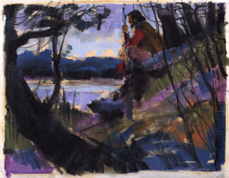
In fact, Will's pastel comps were so exceptionally beautiful that they were often used as finished art. When an art director at Ogilvy & Mather Toronto first commissioned Will to do an illustration for the Hathaway Shirt account, he was so impressed by Will's colour comp that he decided Will should do all future Hathaway ads in chalk pastel.

(Thanks to my friend Dan Milligan, who gave me this piece as a gift. It hangs in my livingroom and I had to shoot a picture through the glass - thus the lousy reproduction you see here)
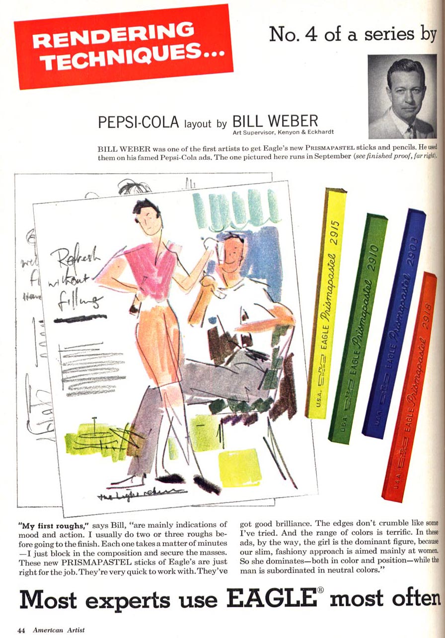
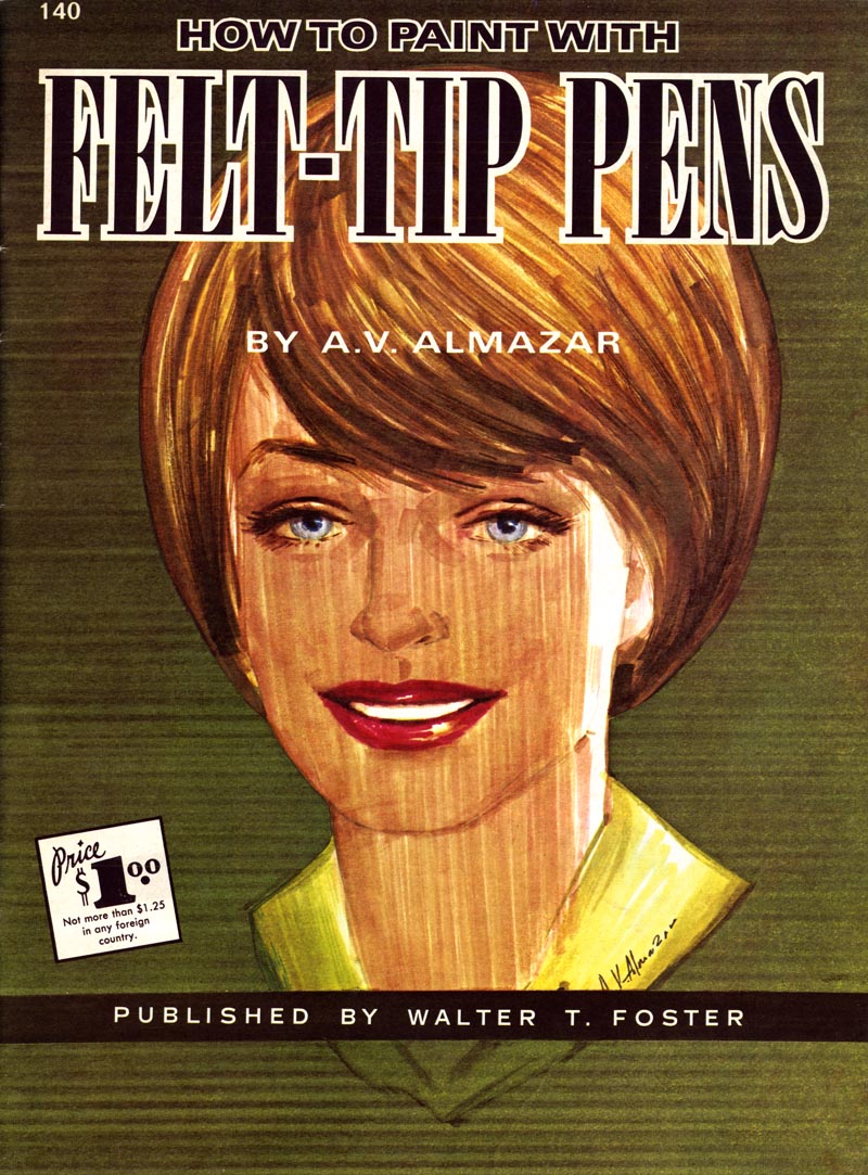
The 50's saw the arrival of a new technology in art materials that changed how comps were done: the 'magic marker'.

Markers had the advantage of being fast-drying and permanent - no more smudging. They contained a felt pad (soaked in coloured dye and benzyne) that could be removed and flattened out like a small sponge, so that broad swaths of colour could be laid down quickly. The effect of marker was similar to that of watercolour but with a much shorter drying time. In the fast-paced world of advertising, this made markers an ideal tool for the comp artist.
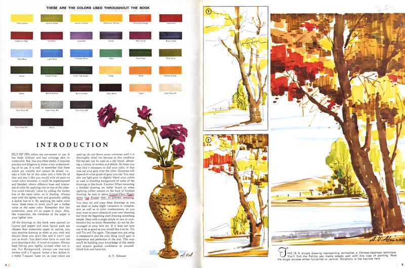
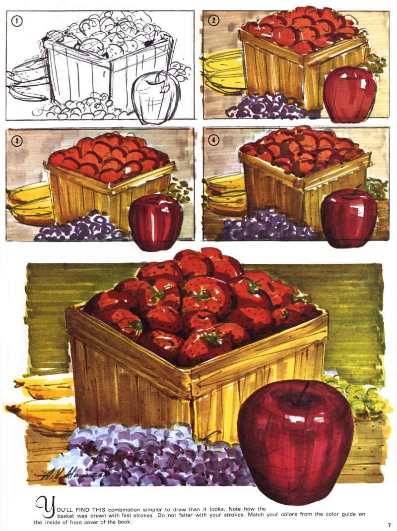
"Marker rendering" became an artform of its own. Not easy to master, and used almost exclusively for presentation comps. Many people will give illustrations like these only a cursory glance. For me, there is an impressive quality of energetic immediacy and a beautiful reductiveness in this type of work.
I suspect that a lot of artists shun comp work because they find it to be tedious. It is in many ways the most mercenary of the illustration arts. You are required to draw fast - and your creative input doesn't generally extend beyond your ability to make a thing look good. The subject matter is often mundane and repetitive.
And as I said yesterday, the artwork is seen as nothing more than a vehicle for getting a visually illiterate client to grasp an ad concept. As soon as the concept has been approved, your drawing loses its value. No one (or almost no one) appreciates it as a piece of art.
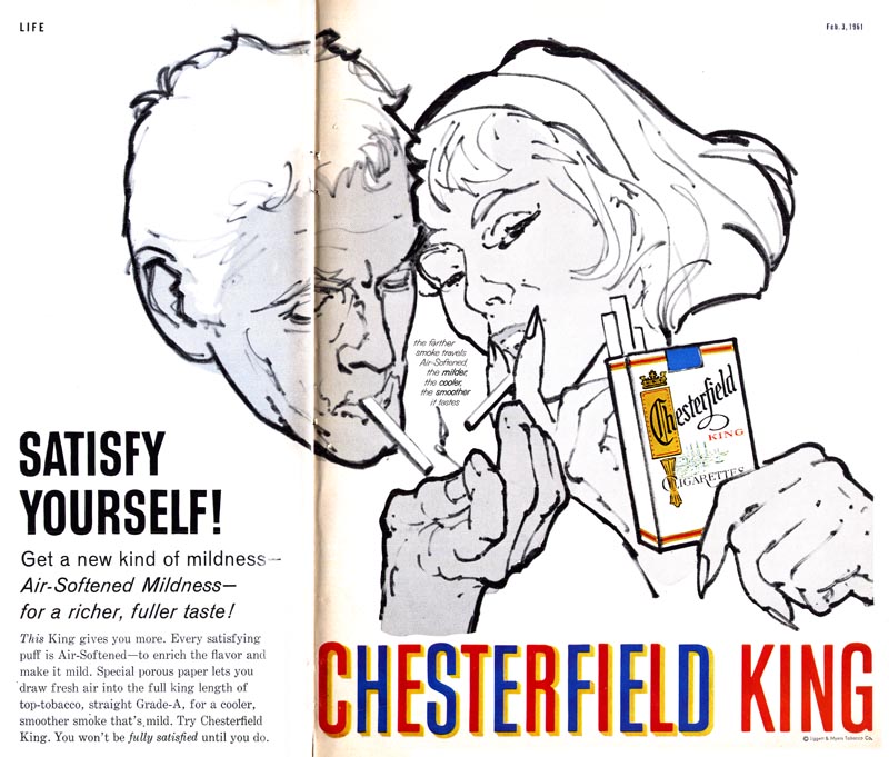
For a some time after markers became commonplace they were ocassionally employed to do finished art, as seen in the ad below. These experiments were, however, short-lived. Marker colours fade quickly and don't reproduce well in print. And I think there was always that nagging feeling among art directors that marker drawings were not valid artworks. There really has always been a sort of weird bias against markers and marker renderers in the illustration business. Believe me, I could tell you stories.
Behind the scenes, however, markers remained the essential medium of layout art and presentation comps for nearly half a century. Only in the last ten or so years did technology cause a massive shift once again: markers have been almost completely replaced by computers, Wacom tablets, and programs like Photoshop and Painter as the primary method of producing comps.
My Will Davies Flickr set.
My Andrew Loomis Flickr set.
My grandpa had these markers when I was a kid, they stunk like hell, he did comps and display lettering in the Detroit area. The chemicals in these things would give you cancer, they were amongst the most carcinagenic chemicals.
ReplyDeleteMike M
That's very true, Mike; the chemical most commonly used in those old magic markers was benzine, a known carcinogen... and some of the old guys would actually keep a can of it by their desk so they could use it almost like watercolour! They'd take the cotton batten out of the marker container, soak it with extra benzine, hold that toxic swab in hand (absorbing benzine through their skin) and sweep it back and forth across their large sheet of layout bond. All the while, (usually) smoking a cigarette! Ah, the good ol' days... ;^)
ReplyDelete