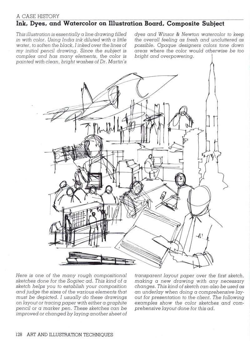
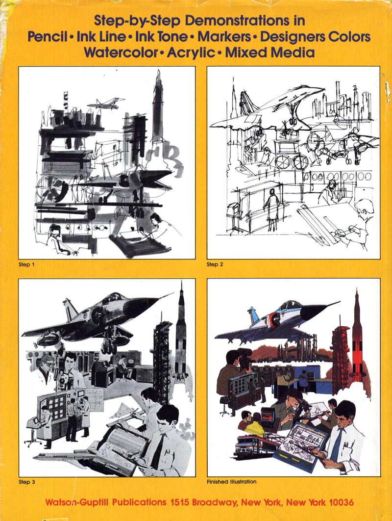
"Comp", short for "comprehensive rough" is just one term for a broad spectrum of illustrations the public never gets to see. Roughs, sketches, marker renderings, storyboards, layouts - these are all terms thrown around in the business that fall under the same general category. In its latest incarnation, these kinds of illustrations have been recast as 'concept art'. Over the past few years, a huge community of artists and companies has grown on the web at a site called, appropriately enough, conceptart.org

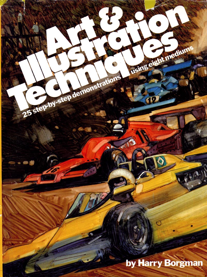
One of our past subjects, Harry Borgman, has literally written the book on comps! I was lucky enough to stumble across a copy of the original 1979 hard cover edition on a recent used bookstore visit.

I began my professional career doing comps and storyboards... and in fact Today's Inspiration, when it was only a mailing list of a dozen or so members, was comprised entirely of storyboard artist friends.
Few people, even fellow 'finished art' illustrators, know much about or have an appreciation for the tremendous skill and discipline it takes to do this type of work. After twenty years in commercial art, I am still in awe of those who do comps well, and still struggle to achieve the quality of work I see coming from the studios of friends and associates. The best make it look maddeningly easy. It is anything but!

Comps, storyboards, and layouts are the precursor to almost any ad - be it for print or television - the public eventually sees. Sometimes drawn by art directors, more often by a 'renderer', they are the initial visual the agency uses to sell an ad concept to the client. Renderers need to be both fast and good. They need to be able to draw anything and everything at the drop of a hat. There is almost never enough time to do a good job. You are expected to do a good job anyway.
Harry Borgman drew comps and storyboards for 40 years. On his blog, he wrote an excellent assessment of what life is like for these unsung heroes of the illustration business. You can read that post here.

There is a tremendous amount of beauty and vitality in comp art, as Charlie Allen wrote in his post this week.
What I've always found a little dismaying is how rarely that has been acknowledged. Renderers are largely anonymous, and renderings are considered worthless trash after a client presentation comes to a close. In my years working in-house at a Toronto ad agency, I watched countless comps being thrown in the garbage. Many of them were, in my opinion, far superior to the art or photography that eventually made its way to the printed page (or television screen).

This week, we'll try to rectify that inequity a little. This week the comp artist gets his due.
* Be sure to visit Charlie Allen's blog and Harry Borgman's blog for some stunning examples of comps, sketches, and storyboards.
No comments:
Post a Comment